

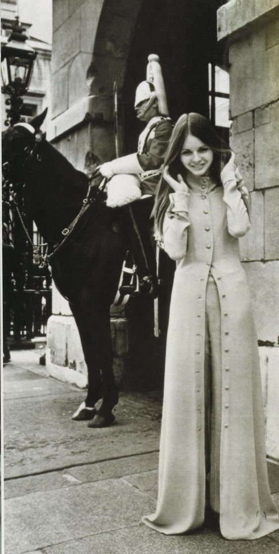
Biba suit, 1960s
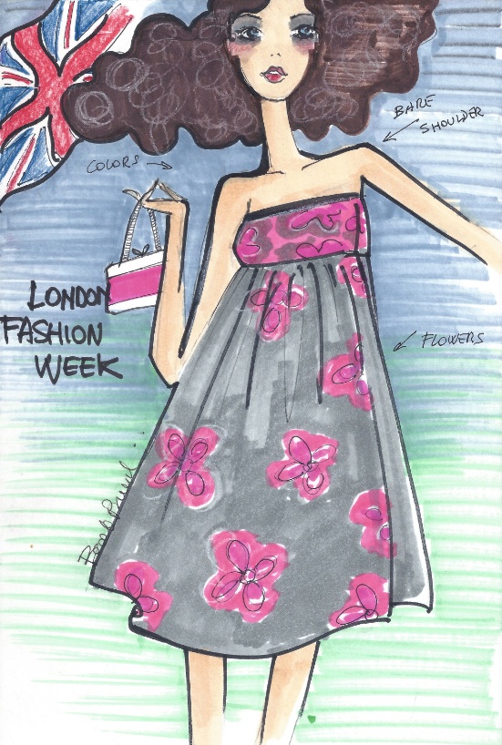
“Julie in London” by Beatrice Brandini
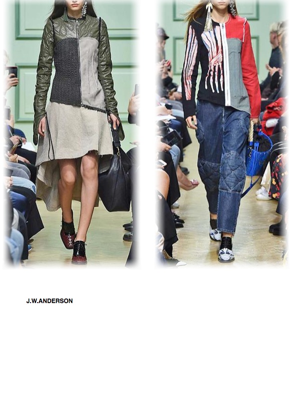
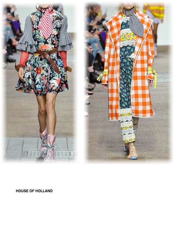
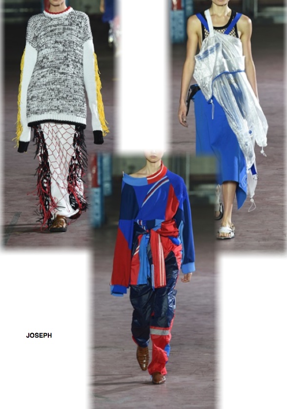
Second appointment with the London catwalk, where, as always, creativity is the common denominator.
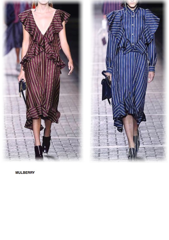
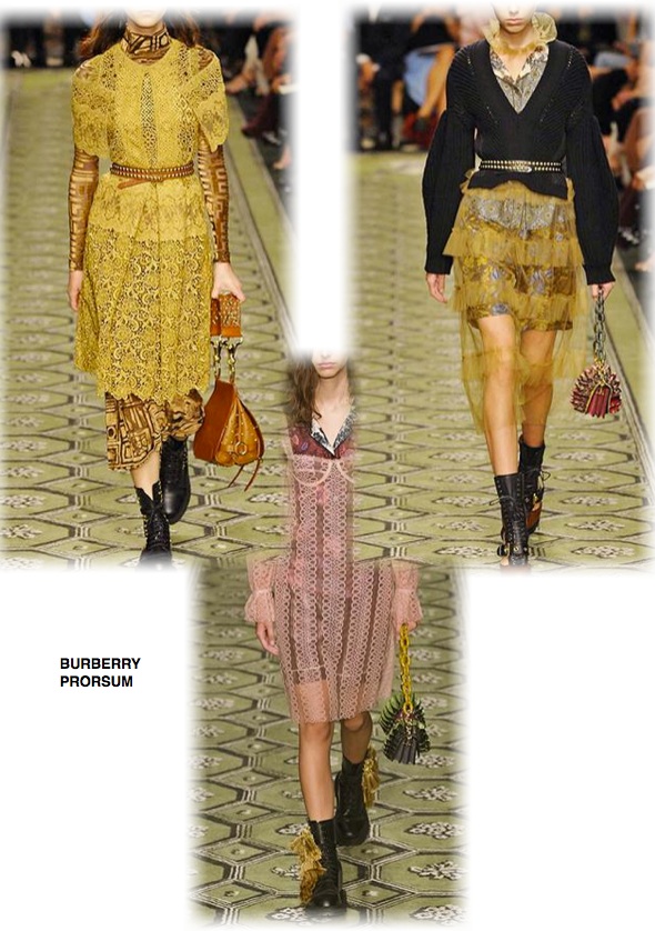
I must say that the trends were fairly aligned with those already presented in New York, I didn’t repeated the themes already treated, as stripe or orange, also found here, but I have shown and reported some interesting mood and certainly protagonists in these walkways.
In this regard it is important to make a general point, probably a little ‘critical but “necessary.” Globalization has influenced and “flattened”, (albeit in a different and milder than other areas), even fashion. A few years ago the fashion shows in New York were characterized to offer a casual fashion, sports. a kind of clothing in a few words, best of all, represented a practical everyday chic (think of Donna Karan or Calvin Klein). The London shows were certainly more eccentric, characterized by extravagance and courage to always be dissident voices (a name of all that of Vivienne Westwood). Those of Milan by the style and “well done”, a concept that is perfectly reflected in the “Made in Italy”, in words that have become a trademark in the world. Finally Paris fashions were the allure a little snob, but very chic, French … Unfortunately it seems to me that in recent seasons we have lost these characteristics and diversity, tending to present a fashion a bit too “aligned”. Pity!
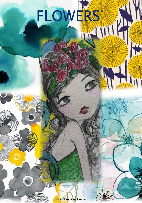
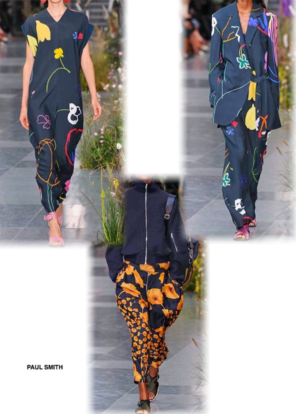
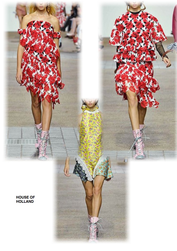
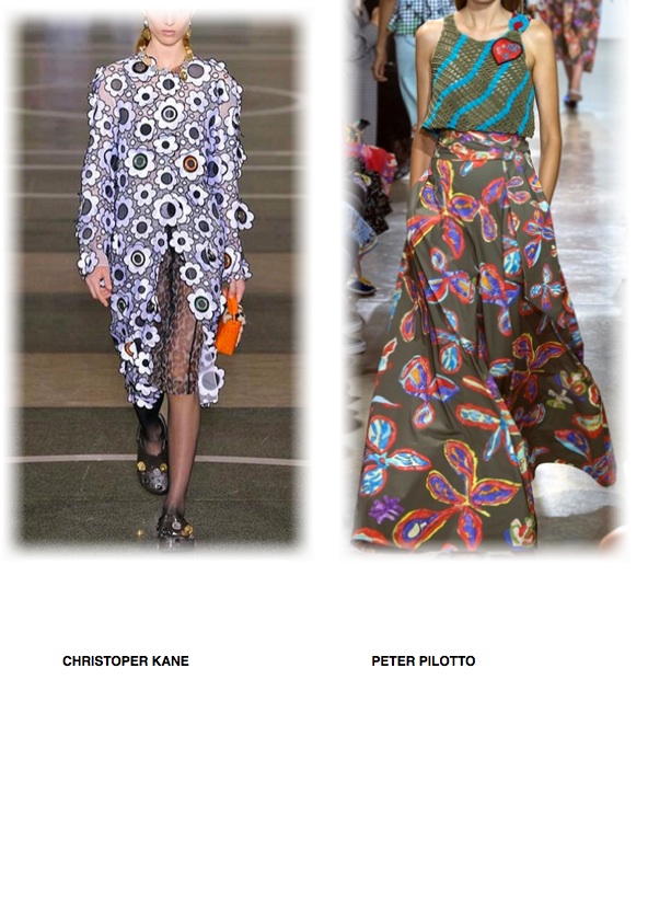
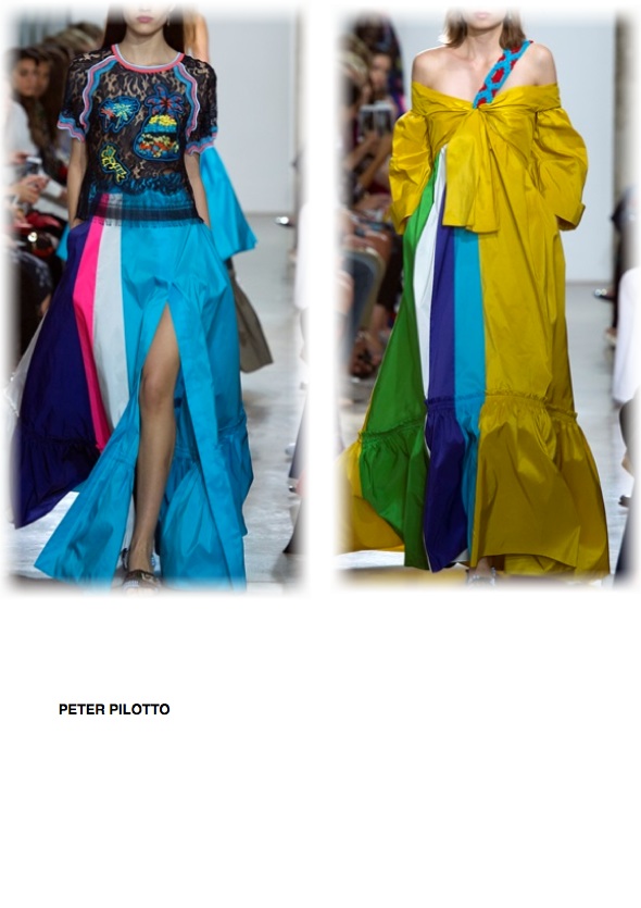
FLOWERS mood board by Beatrice Brandini
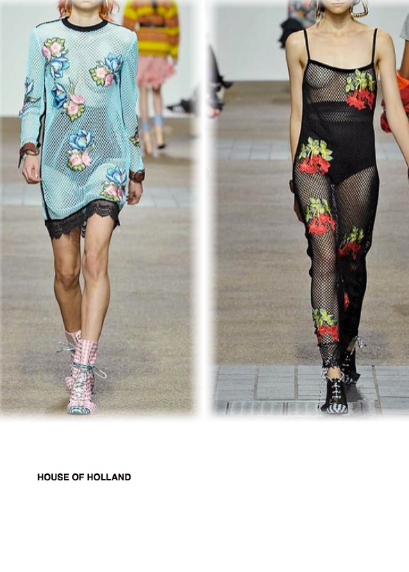
Many the flowers presented, clearly talking about summer what better subject than the flowers … but “these” flowers are not “ordained” or classics, they are beautiful when they become a kind of fabric, ie not printed but embroidered, applied, paintings …
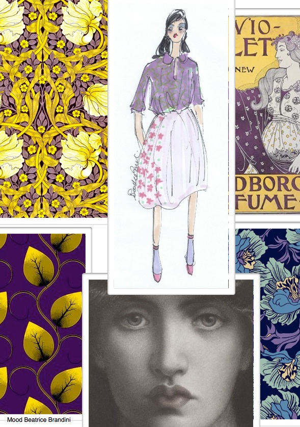
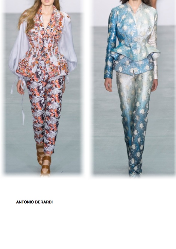
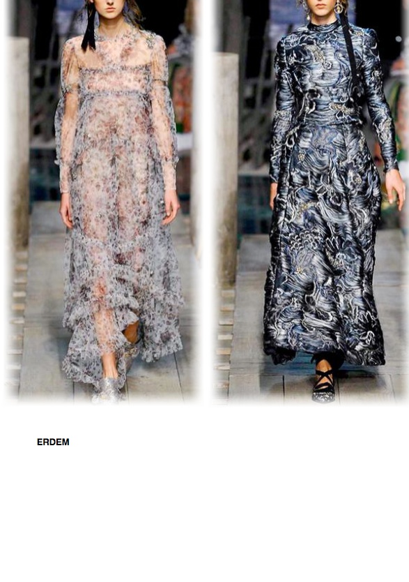
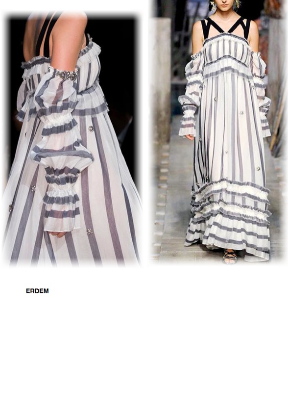
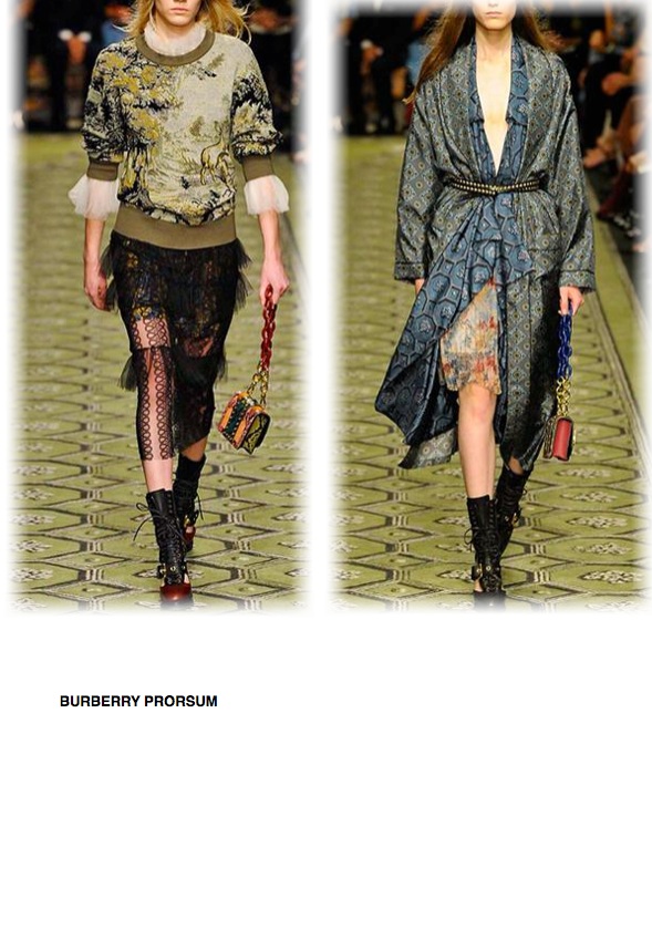
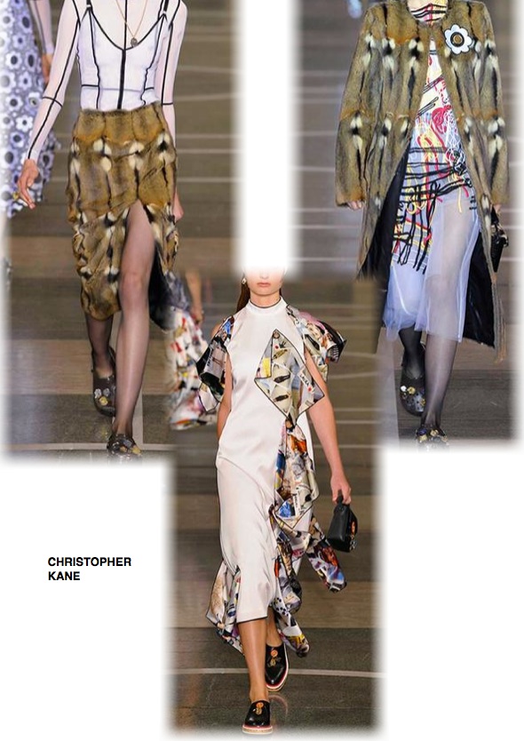
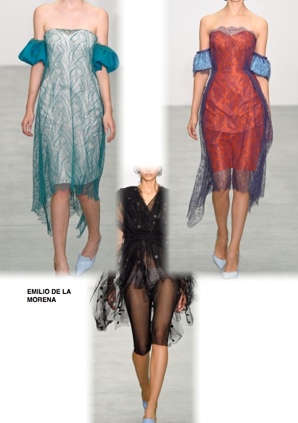
“VICTORIAN AGE” mood board by Beatrice Brandini
Trend that looks to the long period in which Queen Victoria ruled England from mid-nineteenth century to the early twentieth century. Clothes that seem to come from a pre-Raphaelite painting, with floral patterns stolen from tapestries, precious fabrics like damasks, silk jacquard, laminate colors. Preciousness.
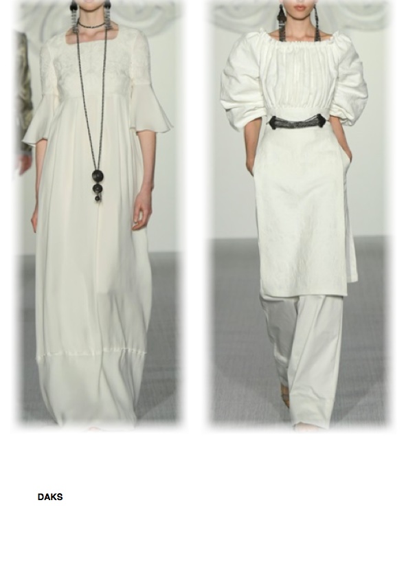
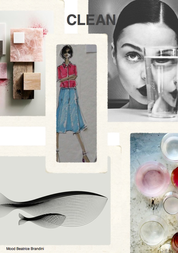
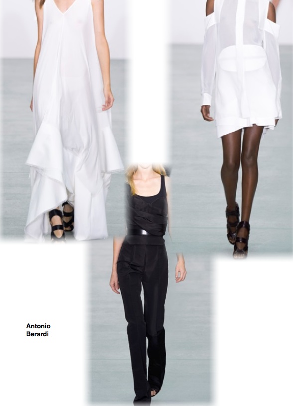
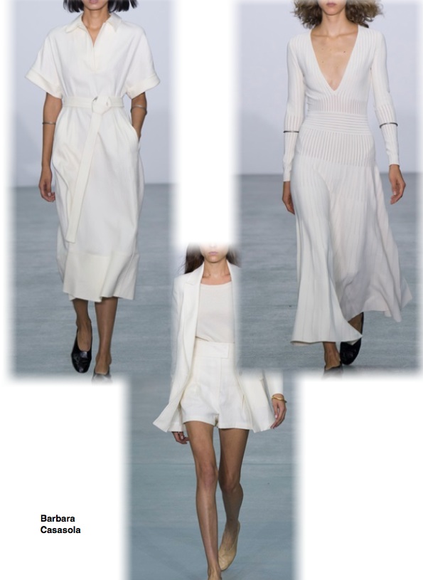
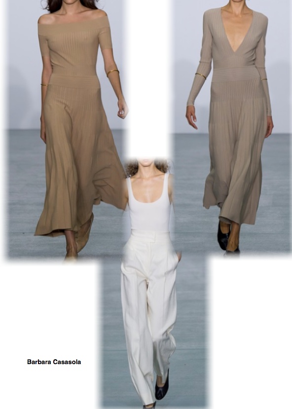
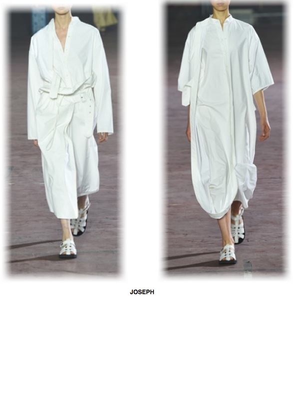
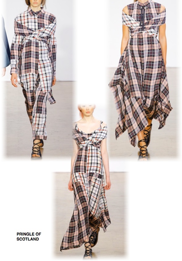
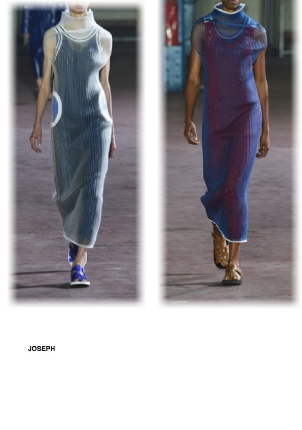
“CLEAN” mood board by Beatrice Brandini
Trend that is completely opposed to those presented or later. Here the key word is discipline, cleanliness, simplicity. Clothes fluid, soft, rich fabrics in the sense of pleasure and comfort, but also qualitatively (yarns and fibers). Neutral colors.
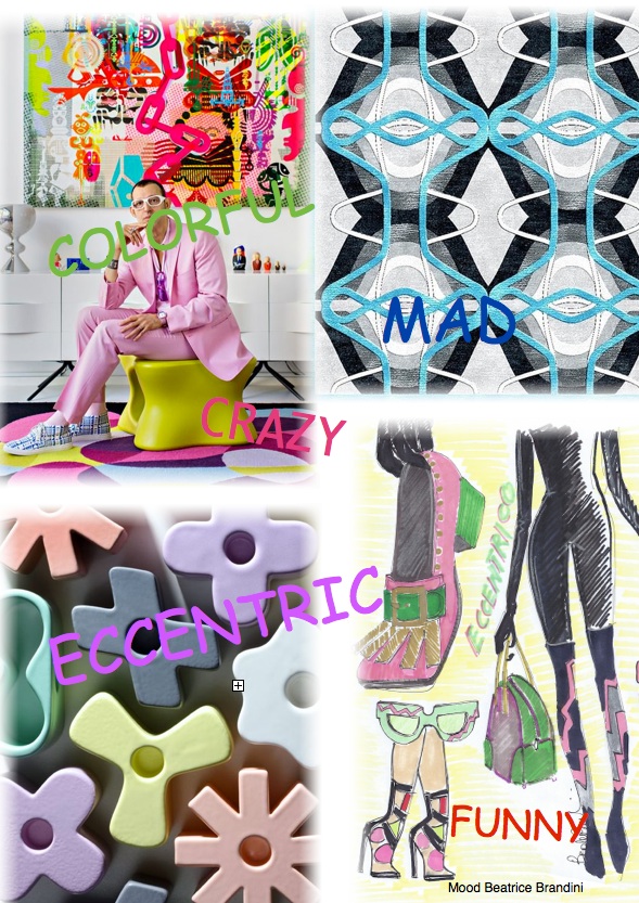
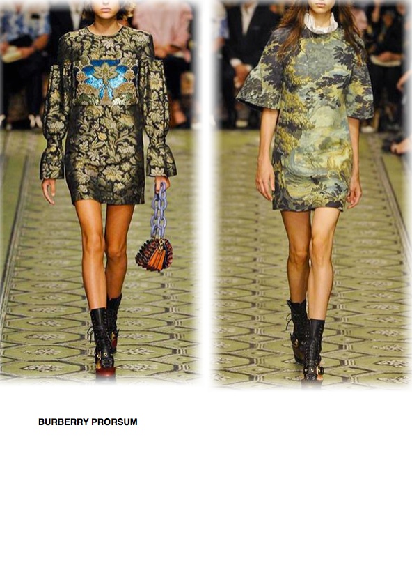
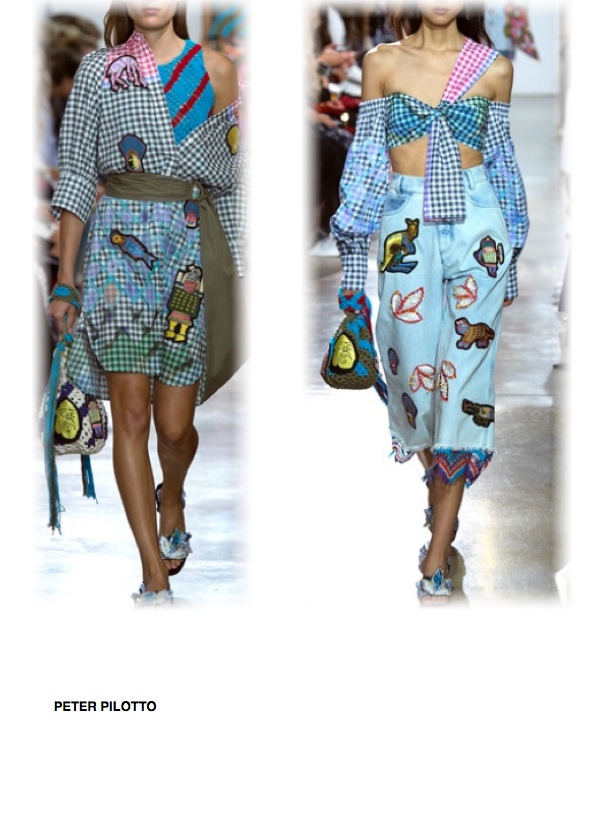
“Mix & Match” mood board by Beatrice Brandini
Once again, freedom and fantasy. Freedom to approach the seemingly different things between them, freedom to mix and match styles, colors, fabrics, patterns. A kind of precious kitsch. Nobody (or almost) wear all these things together, certainly not in the office or at the supermarket, but it will be nice to dare and have some fun ‘.
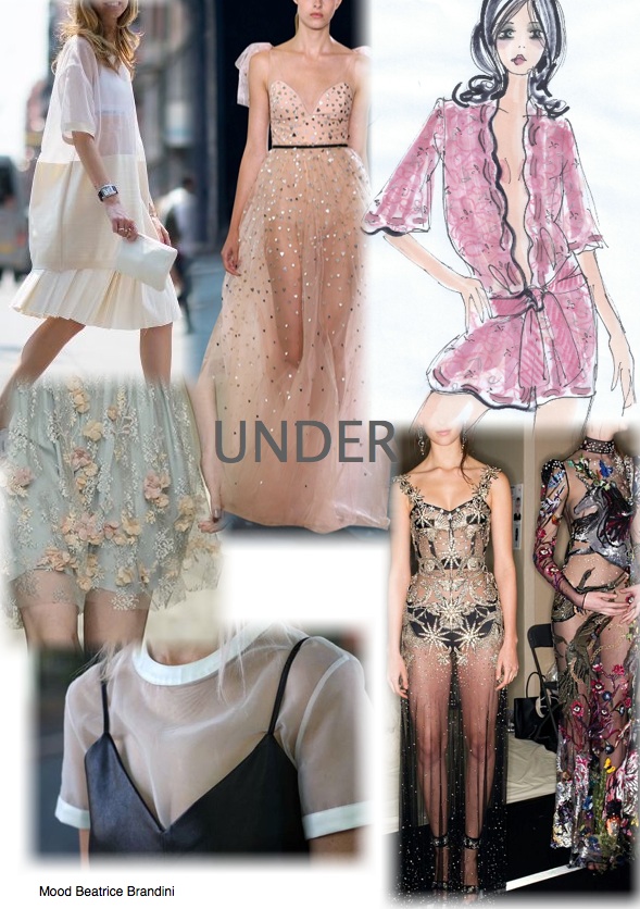
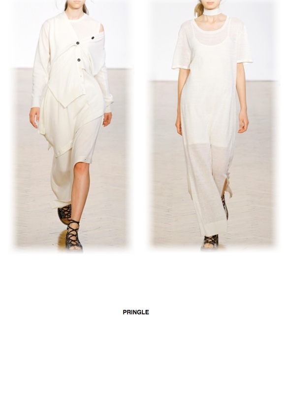
“UNDER” mood board by Beatrice Brandini
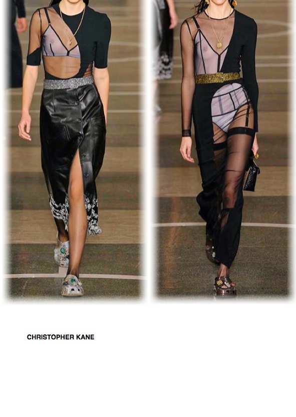
It’s a trend that one side takes possession of what we wear in intimacy, to take him outside, other side people dress with several layers, the latter is often able to highlight what brought below. Many clothing or skirts midi with a view of a culotte or a second much shorter skirt. This is not about transparency per se, here the “issue” is much more conceptual.
Appointment with the catwalks of Milan from which I and others, we always expect a lot.
Good life to everyone!
Beatrice